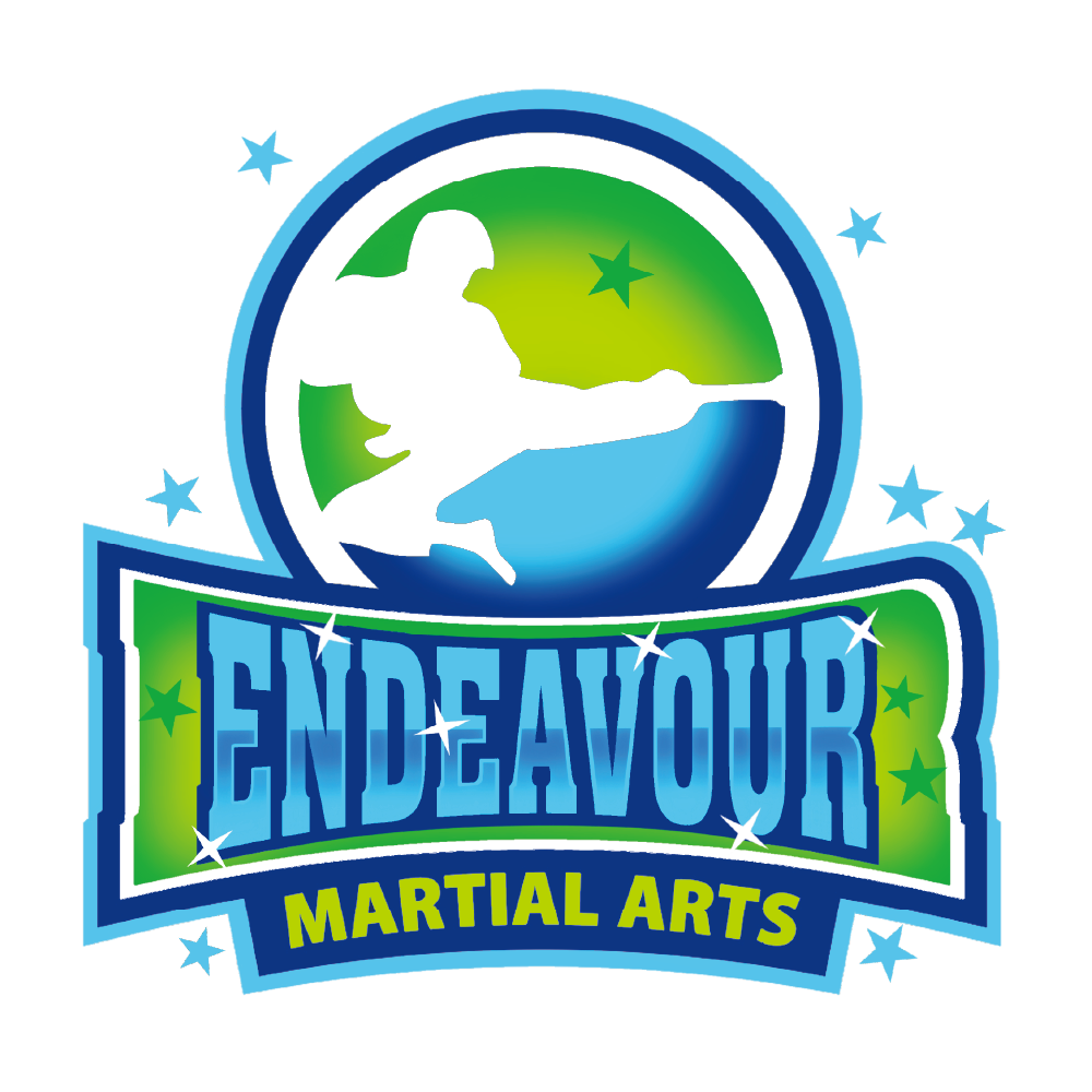

This logo follows the principles of Memorable, Aesthetic, and Functional design, ensuring a seamless evolution of the brand while unifying its visual identity.
🔹 Memorable – The high-kicking martial artist remains the focal point, preserving the strong brand recognition of the original logo. The circular background and energetic typography enhance visibility and make the design instantly recognizable.
🔹 Aesthetic – The transition from the original red-and-black scheme to a vibrant blue-green palette creates harmony between the martial arts school and the summer camp branding. The bold, modern typography strengthens the dynamic and professional appearance.
🔹 Functional – The clean lines, balanced composition, and scalable design make this logo highly adaptable across various platforms, from uniforms and signage to digital marketing. It ensures brand consistency while appealing to both long-time members and new families.