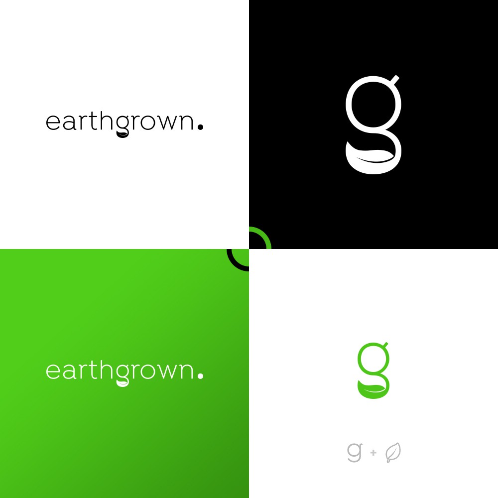
Logo Concept for Earthgrown

2
Creados en 99designs de Vista
Client Brief : "earthgrown is a nutrition company that specialises in earth grown supplements that optimise your health and performance. I like minimalist designs, clean and simple. for the logo we would like to just have the word 'earthgrown' with a full stop '.' after it, all in lower case for example: earthgrown. simple and clean."
...
Design Concept : This wordmark logo is very simple but yet truly meaningful.
Top circle of letter 'g' represent the earth and bottom leaf represent the natural. overall letter 'g' gives the idea of grown from earth.