Logo Concept for Midwest Affordable Homes

1
Creados en 99designs de Vista
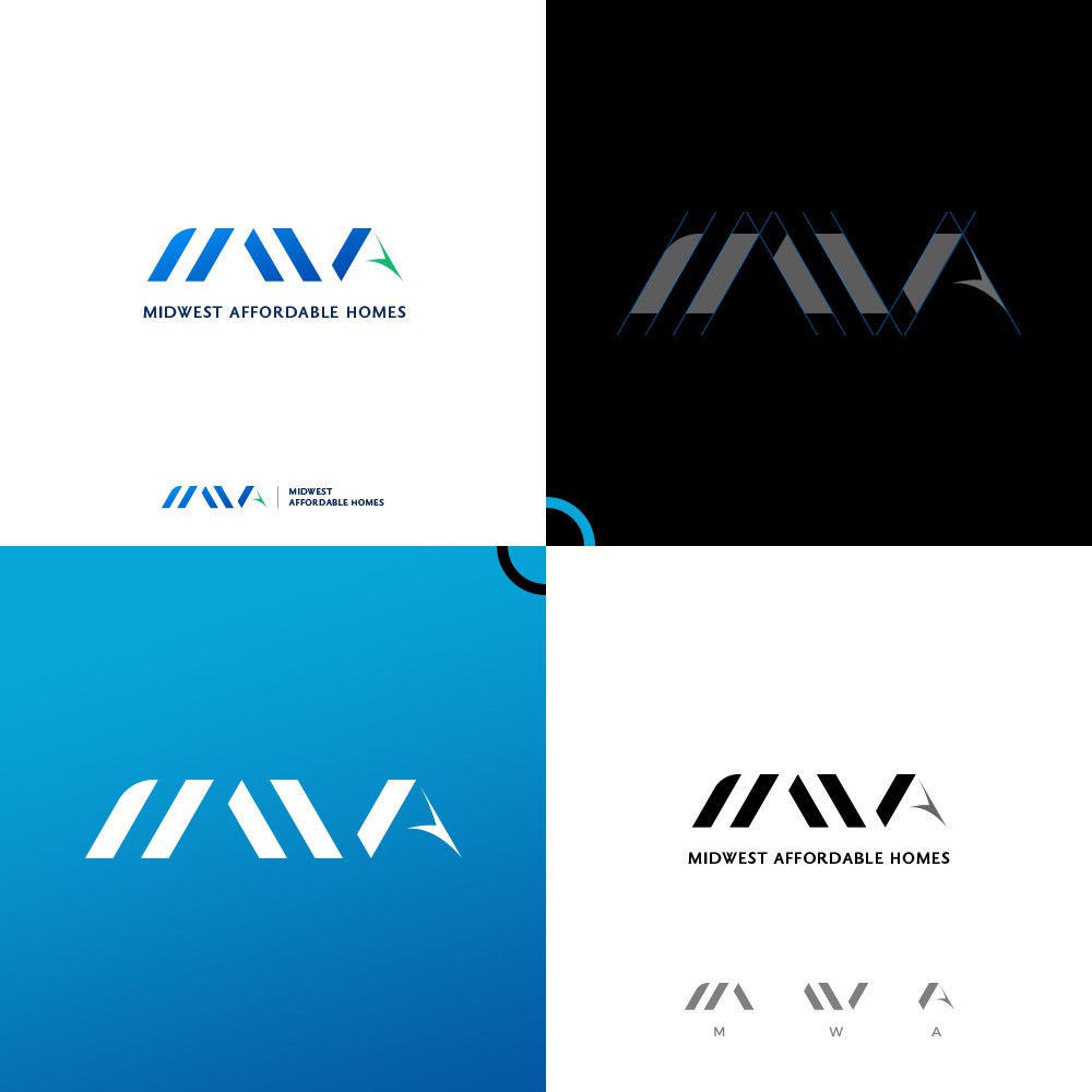
Client Brief : "This is a real-estate investment company focused on low income housing. Target audience is investors and prospective tenants. Subtle incorporation of a roof on the "M" or the "A" could be explored. I also really like the Waymo logo as inspiration."
...
Design Concept : Letter 'M' , 'W' , 'A' combined together in geometric way to give the idea of architect. Also these shapes represent the roof pattern of a house.
Font: Bold & Clean Sharp letters add a very professional look to this and also it's very readable to any age from any distance.