Bold logo for LLC raising awareness of Autism

1
Creados en 99designs de Vista
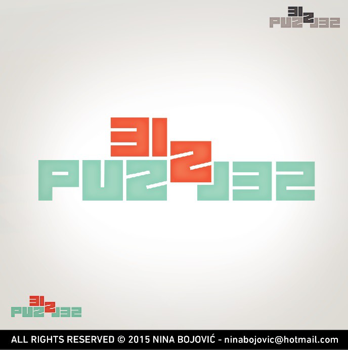
Due to psychological aspects of these colors client specifically asked for them which I supported and just found more friendly tones to make them fit better together. Since typical puzzle shapes were to be avoided, while the concept of the puzzle was welcomed - the idea behind my solution was to use the length of the name and construct letters out of simple shapes and create a puzzle out of non-puzzle shapes that with their different approach (reflected "L") manage to make a functional whole that even though stands out - it still stands on its' own - which is a metaphorical depiction of autistic people. :)