An investment company logo

1
Creados en 99designs de Vista
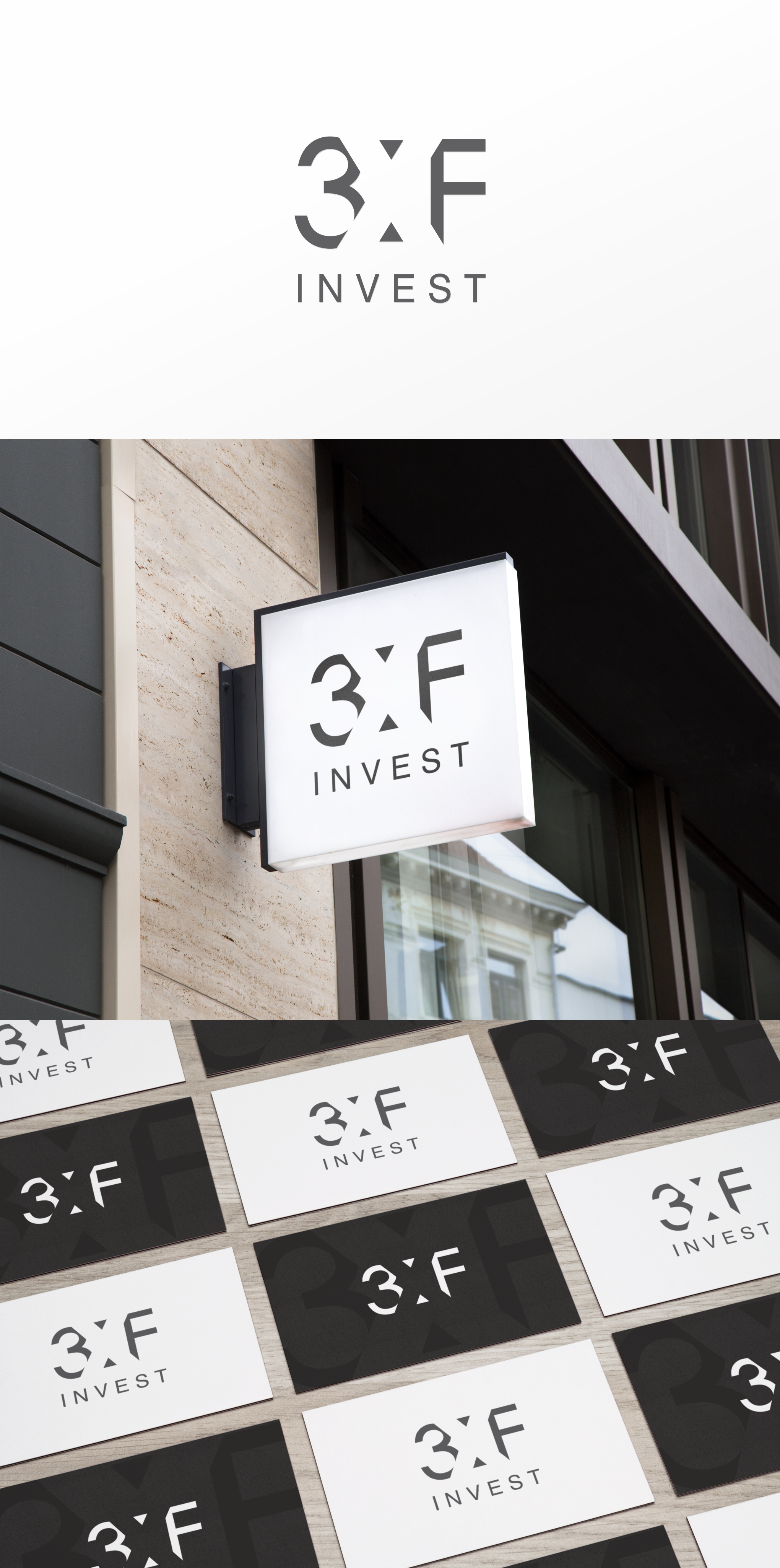
The 'X" actually has extra meaning as "times" in "three times fair" so it has to be different somehow. On the other side - I wanted to make the negative space (optical) tension stronger, and the logo more dynamic.
Here it is. It's livelier, interesting and catches the eye. I've been staring at it for some time now, and it still doesn't bore me.